PATRICK JOHNSON
Blending architecture, imagination, and sustainability to shape the next generation of story-driven environments.

I am an architecture student at the University of Utah exploring themed entertainment and sustainable design. My work focuses on creating immersive, environmentally responsible spaces that craft meaningful experiences for future generations.
PROJECTS
Select an image to learn more

Community education space in New York City with emphasis on avian habitat reclamation & site integration.

Re-imagining of a Salt Lake City gas station with community driven elements in a Googie style.

Community arts center in Taylorsville Utah designed with a pre-determined building program.

Theoretical explorations into the 3D space with specific emotions in mind.

IN THE WORKS
- Modular Migrant Workforce Housing (School)- History Exhibits at Camp Williams (Internship)


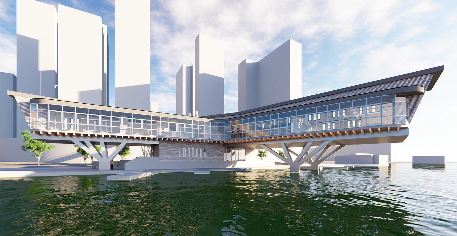
BIRDHOUSE
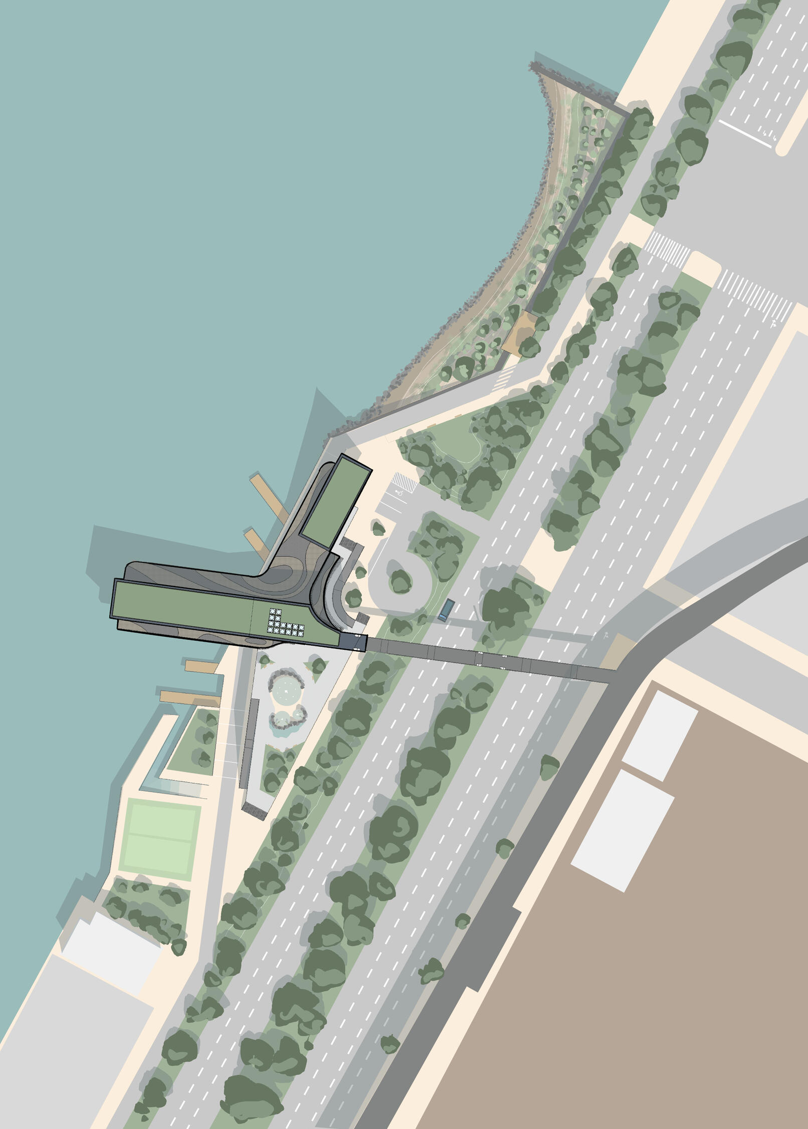
Site Location
Project Overview: This project focused on the creation of a community education space along the Hudson River in NYC.Design Challenges: Long & Narrow site alongside busy road. Unable to visit site in-person.Design Opportunities: Near the High Line trail allowing for pedestrian connection over roadway. Opportunity to reclaim habitat for local bird populations.Tools Used: Revit, Lumion, Sketchup, Procreate, Illustrator, Physical Modeling, Laser Cutting, 3D Printing.
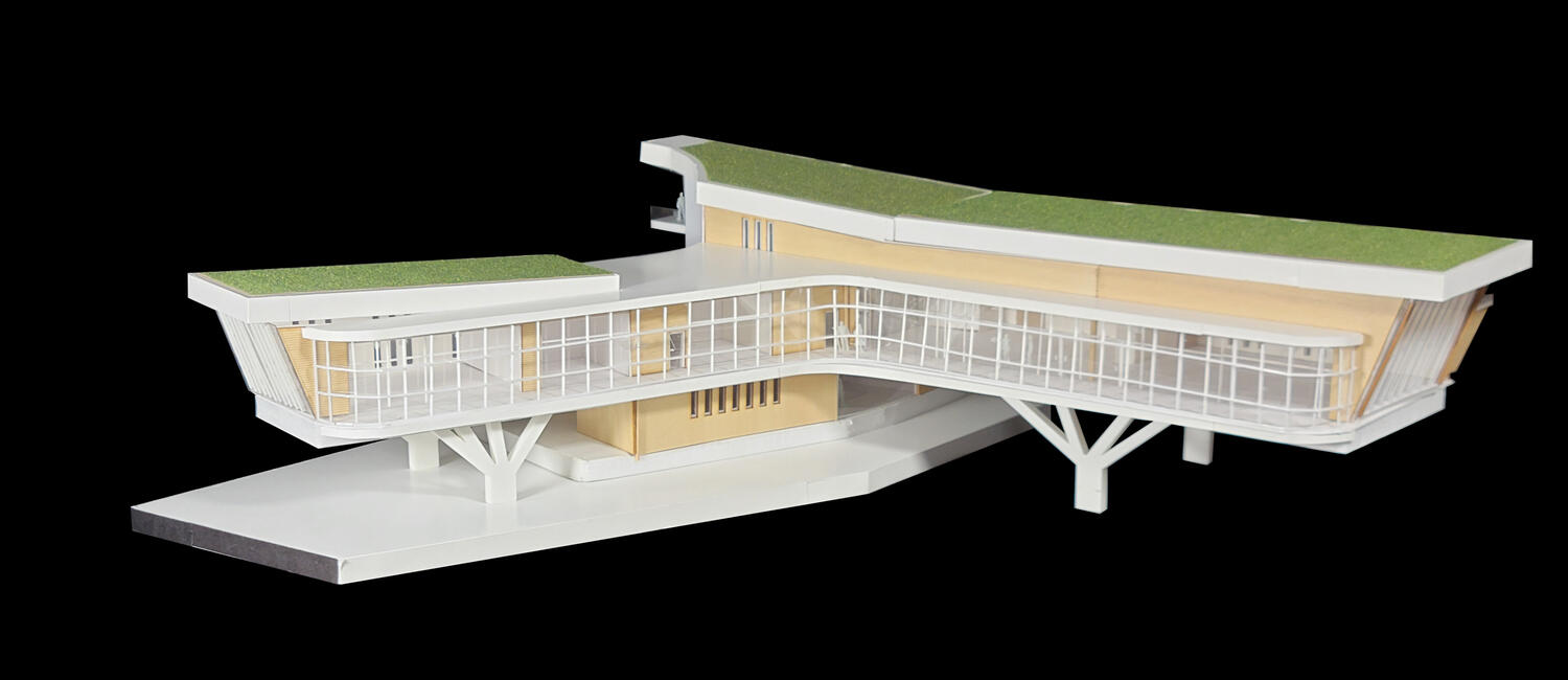
Design Process & Early Iterations
After exploring various forms, I chose to minimize the footprint of the ground floor and extend the wings of the second level in two directions: parallel to the riverbank and out from the connection to the High Line. This orientation helped maximize the river view from the building.
FINAL DESIGN
The final site is split into two key uses: urban recreation, and natural reclamation. To the north the site is restored to salt marsh for the benefit of threatened local species highlighted by the NYC Bird Alliance. To the south the site features a splash pad, fishing piers, pickle ball courts, and a picnic area. Per the given program, parking is minimized in order to encourage public transit & pedestrian path use. Green roofs were selected to provide additional spaces for birds to land free from human interaction and dot grids would be applied to glazing to reduce likelihood of bird strikes and injury.
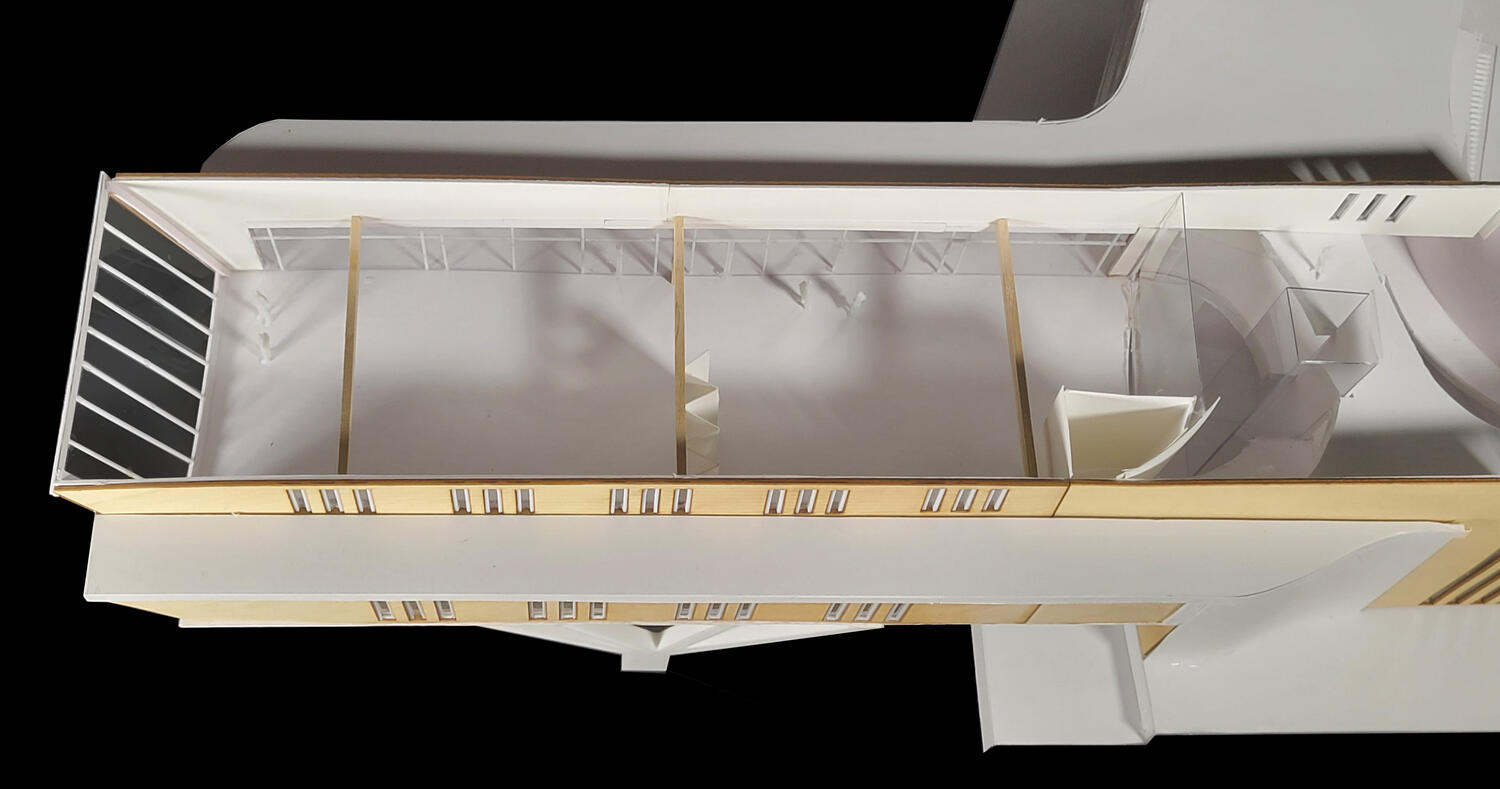
FLOORPLANS
REFLECTION
If given the opportunity to undertake this project again, I would like to take more inspiration from the avian visitors to the site and apply that through the form of the building. I feel that the physical model could have been improved with better precision and planning. There are elements such as the wavy ribs along the street-facing facade which I had hoped to 3D print but was unsuccessful. Nonetheless I learned a variety of new programs and technologies to apply towards projects in the future.


BODEGA 2.0

Site Location
Project Overview: This project focused on the re-imagining of an existing bodega in Salt Lake City.Design Challenges: Located along busy road. Large un-housed population. Design response had to be completed in around 6 weeks.Design Opportunities: High foot traffic. Diverse user group. Popular area for tradespeople to take lunch breaks.Tools Used: Revit, Photoshop, Illustrator, Physical Modeling, Laser Cutting.
Pre-Design Understanding
Before re-imagining the bodega, we needed to understand the building that currently occupies the site. In groups we were tasked with studying the existing Fastrac Gas Station and its structure before recreating it in a 1/4" = 1'-0" scale model. With a limited time frame I leaned heavily on my restaurant management experience to help coordinate our group and get the ball rolling. I placed importance on what each group member wanted to learn how to do when splitting up tasks. Ultimately this created a very fun and efficient experience where each person got to focus on their personal goals or interests. For my group contribution I did the final model assembly, paint, and the wall/roof section details.
Design Process & Early Iterations
To explore building massing I repurposed some old Jenga blocks and painted them blue for public space, and orange for private. Ultimately I found that a U shaped building worked best with my program, particularly for my goals of creating indoor-outdoor spaces.
Given the sites vehicle traffic I found the Googie architecture style to be a great fit. I opted to include some oversized elements and signage to catch the eye of passing motorists.
Final Design
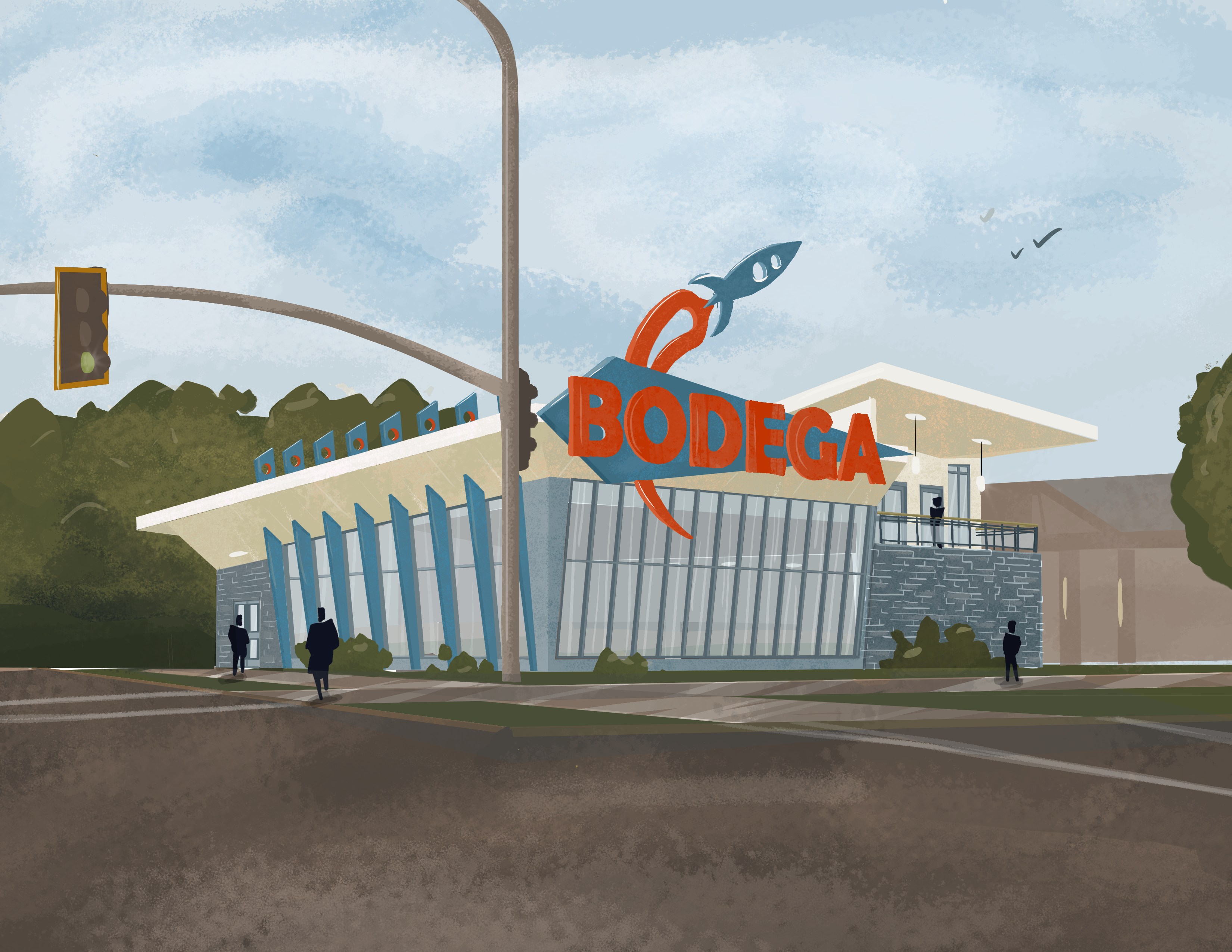
The street-facing facade of this building is designed primarily with motorists in mind. A large marquee can be seen from a distance, giving cars time to shift lanes and to access the bodega. The rocket was chosen to add a bit of personality and fun to make the brand stand out amongst competitors nearby. Similar to the Sinclair dinosaurs, I hoped to make the space more approachable to families.
The rear facade is broken up with several key community engagement points to allow the bodega to become more interwoven into the fabric of the neighborhood. By including this variety of secondary uses and visitor experiences the bodega becomes more than just a convenience store, it becomes a garden, meeting place, waste processing facility, and safe space.
FLOORPLANS
REFLECTION
During the design of this project I recieved quite a lot of criticism for choosing the Googie style for inspiration. I not only learned how to better explain or defend design decisions, but also how to receive somewhat harsh critiques without being disheartened. If creating this project again, I would still choose googie architecture for inspiration as I feel it fits the needs of the site. What I would do differently however is to better format my presentation boards to follow more of a narrative allowing me to better explain my reasoning.


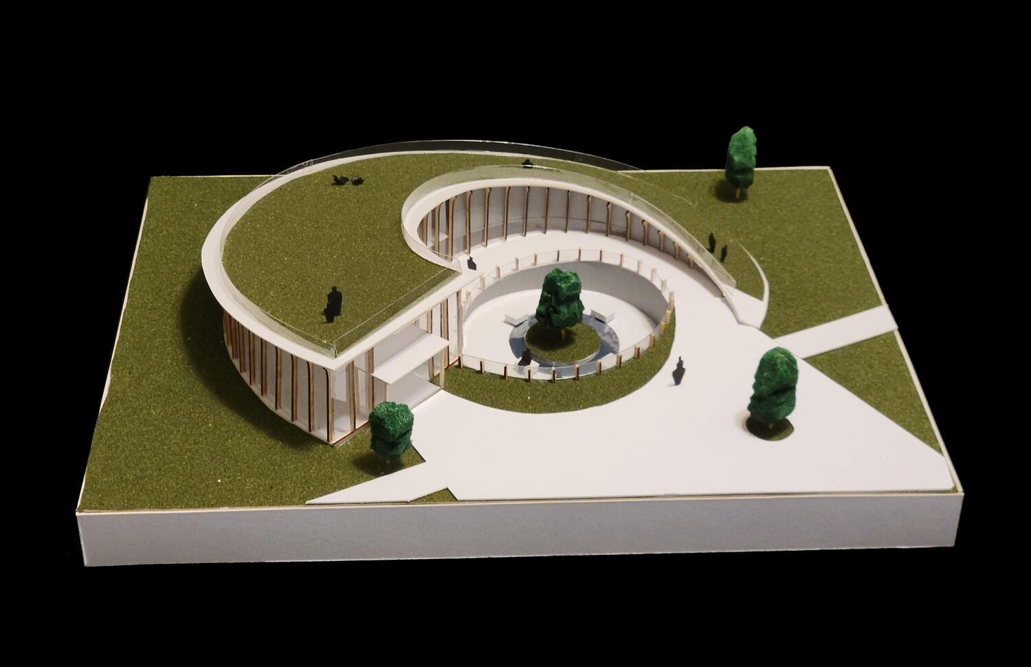
TAYLORSVILLE COMMUNITY ARTS CENTER
Site Location
Project Overview: For this project we were tasked with creating a community center on a relatively flat and unused site.Design Challenges: First time using a building program as part of a design.Design Opportunities: Relatively blank canvas.Tools Used: Photoshop, Illustrator, Physical Modeling, Laser Cutting.
DESIGN PROCESS
From the beginning, I knew I wanted to manipulate the project site to break up the flat field the building would occupy. I really liked the idea of a below grade secondary entrance with a path spiraling down to create a quiet garden area. Later I began to explore my design concept with sketch models to find a mullion system that I liked. Ultimately I selected a design reminiscent of the ribs inside a mushroom.
FINAL DESIGN
Similar to other projects I have worked on, one of the key goals for this community art center was versatility and inclusion. Ideally all forms of art would be welcome here, even including designated outdoor spaces for graffiti and mural artists to display their craft. Versatile classroom spaces would allow for different subjects to be taught alongside a flexible lobby designed with art exhibitions in mind.
FLOORPLANS & SECTIONS
REFLECTION
During the design of this project, I reached a dilemma; my concept had geometry which was too complex for my working Revit knowledge at the time. I had to choose to either simplify it to fit Revit, or to finish the project relying on drawing and model making. Fortunately I chose the latter which left me with a final product that I am still proud of. Unfortunately that was not a quick decision and I tried doing both for longer than I should have. This project taught me the importance of going with your gut and making a call.


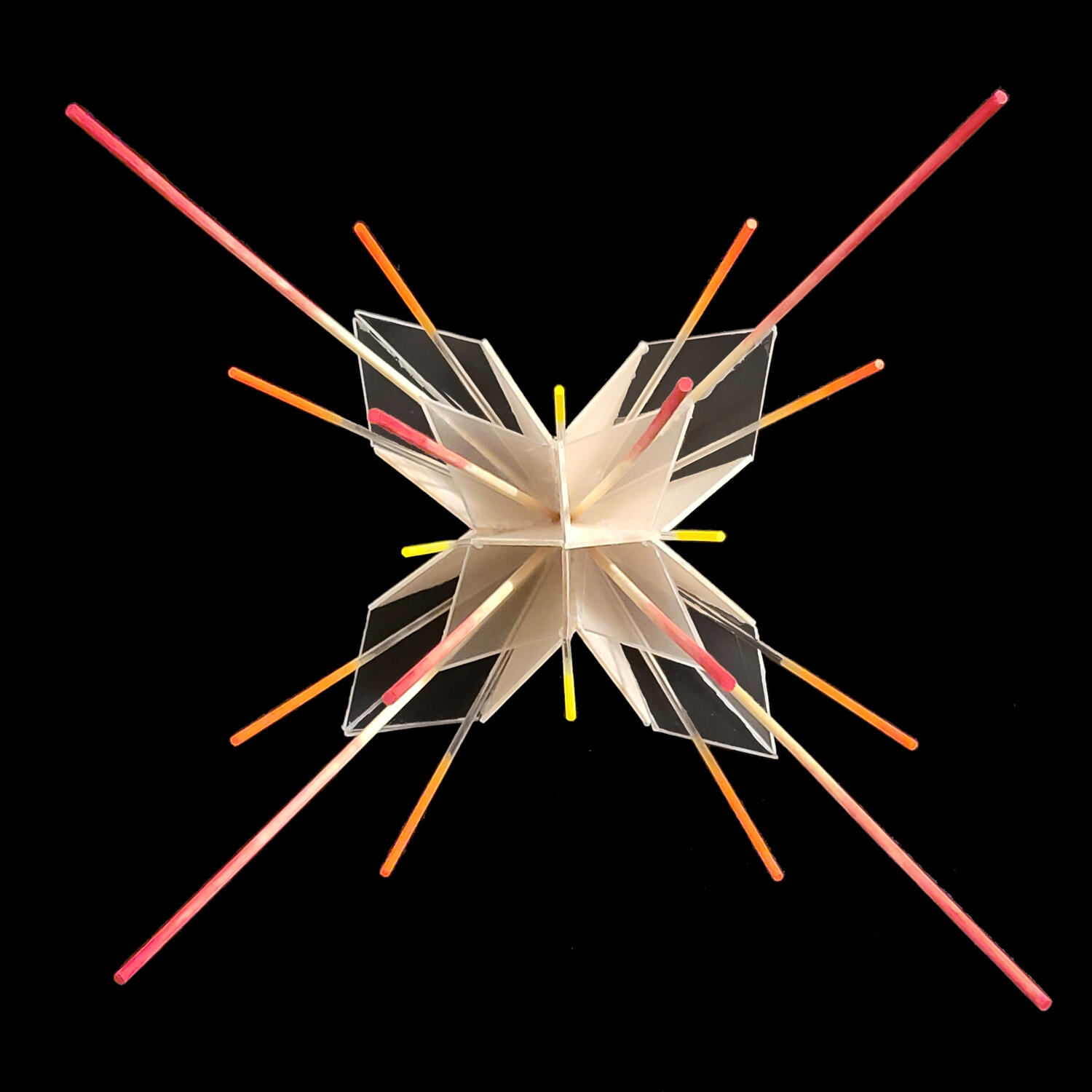
ENERGY & AWE
Project Overview: This project was split into two phases: Energy, an exploration of 3D form; and Awe, translating the design into a structure.Design Challenges: Evoking emotions from color and form alone.Design Opportunities: Opportunity to explore a design that utilizes lights.
ENERGY: DESIGN PROCESS
This exploration began with plain paper and no adhesive. Through folding and twisting the material I created a form evoking an explosive burst of energy. Carrying this concept forward I began to explore material, selecting wood for its durability but relatively neutral tones. Finally, with the addition of color as well as acrylic rods to replace the wood I felt this design captured the energy I sought.
AWE: DESIGN PROCESS
To start the transition from Energy to Awe, I needed to first understand ways that an architect can evoke said emotion. Compression and expansion was my answer. I chose to sink the form of Energy into the earth and have visitors enter at the tip of the cone, experiencing a moment of compression before having the structure open around you to frame the sky.
AWE: FINAL DESIGN
While we had no specific requirement to include a site for this project, I wanted to place the structure at the top of a gentle hill beyond a small group of trees. This would give preliminary glimpses of what was to come before obscuring the view in order to build anticipation. Pillars of light reach out into the night sky creating a cathedral of the cosmos once past the threshold.
REFLECTION
At the time when this project was created, I lacked a lot of confidence as a designer. I felt strong in my ability to model things physically but my proficiency with sketching and modeling software was lacking. I kept experiencing frustration when I would try to do experiential drawings and they did not capture the feeling or emotion that I wanted. If I were to do this project again, I would be more daring with these drawings and explore other methods of conveying my point like collage or abstract art.


WATERCOLOR


DIGITAL SKETCHING


DIGITAL LANDSCAPE


ENGAGEMENT RING


Of all my artistic pursuits, this one is by far the most meaningful to me. As I was preparing to propose to my wife I made the decision that I would design and produce the engagement ring myself. At first this was a scary idea, I had designed jewelry in the past but nothing of this level of importance. Most of these designs were developed digitally and the work I had done by hand previously was relatively amateur. With the mentorship of my dad I dove in head first, and while it has its imperfections, the ring is truly one of a kind.
Had I just settled for a store bought ring I feel that I really would have missed out on some important lessons from this process: Iteration, problem solving, the connection created from working with my hands, and the reward of seeing the finished product.

